Written By Bonny Isselt.
Graphic design examples are vital for enhancing your design skills and attracting readers.
They provide clear, visual references that showcase effective use of color, layout, and typography, helping you understand what makes a design successful.
Here are five eye-opening statistics that highlight the importance of graphic design:
- Content with visuals gets 94% more views than text alone. (Source: Infographic World)
- Visuals are processed 60,000 times faster than text, making them essential for effective communication. (Source: 3M Corporation)
- 92.6% of consumers say visuals heavily influence their purchasing decisions. (Source: HubSpot)
- Blog posts that include images can see a 650% increase in engagement. (Source: HubSpot)
- Social media posts with images are 40 times more likely to be shared than those without. (Source: Buffer)
A well-organized tab order helps SEO rankings.

Also from an SEO standpoint, it helps when you get the tab order right, so how better the tab order, etc., depends on how you organize your website.
So, on this blog, we use SEO practices and apply them to the layout and navigation so we end up with high accessibility and best (SEO) scores.

Table of contents
How is a good design structured?
The design features a clear navigation menu and logo that reflects your brand. This helps users easily navigate the website and reinforces brand identity.
A good navigation menu allows visitors to quickly find information, while the logo aids in brand recognition.
Consistent visuals also improve the user experience, encouraging visitors to stay longer and return.
Your text should be clear, with a straightforward purpose, explaining how your offering makes the user’s life easier.
- The overview layout is clear.
- Have a clear layout.
- Use simple words so it’s easy to read and understand.
- Be helpful and friendly.
- Create white space between the text and designs.
What does a graphic designer do?
Create awesome things like logos, original images, and cool illustrations to share your message. Put together layouts by choosing colors, images, and fonts that vibe well together.
Credit Webflow.
How can you stand out with a design?
There are some useful tools you can use; I use them too. One is a color picker that lets you click on a color from a website you like, and it shows you the color code.
Other good graphic design resources to help you stand out include Canva.
Here are a few posts that I made with Canva. These graphic design examples give you an idea of how to use them, so let these posts inspire you.
Cool 10 Food-Inspired Designs Made In Canva
Need A Canva Logo? Try These 10 Templates
Achieve Your Design For Business Goals With Canva
3 Tips For Making Your Design With Canva Awesome.
Grab Attention With Canva: 10 Dead Simple Templates
10. Graphic design examples
To give you 10 graphic design examples, it is important to look at the different styles and techniques that those designers use.
These examples can range from simple designs with clean lines and few colors to vibrant, complex compositions with striking visual elements and typography.
We analyze each example to understand how colors, shapes, and the impact of design work, so you gain better insight into the various approaches to graphic design for your projects.
1. Chipie design

What does Chipie design do?
They are great designers and one of my favorite graphic design examples that I want to write about. “Well, that being said.”
They work on branding a lot, and their illustrations are spot on.
They are ex-workers of Reebok and are good at creating brand strategies.
Plus points of Chipie design:
- The layout is clear and fresh.
- They use white space in their layout well.
- The navigation menu is clear.
- A great showcase of their portfolio.
- Great color palette.
It’s a bummer they don’t have a blog for more info.
2. João VerÍssimo

What does João VerÍssimo do?
He is great at motion graphics. His service is about helping and teaching through motion. The layout is interactive and has a navigational menu that is intuitive.
Plus points of João VerÍssimo website:
- Interactive.
- A great showcase of the portfolio.
- Clear navigational menu.
- The text and font are great.
What we do not like is the color palette; it scares people off because it is too dark.
3. MBC Creative

What does MBC Creative do?
They build awesome websites that really crush it in SEO! Their animated layout showcases their projects and case studies in a fun and engaging way. You’ll find out what they’re all about, and they’ll excitedly let you know why picking them is such a smart move!
Plus Points of MBC Creative:
- Clear navigation menu.
- Interactive and lively.
- Well-chosen colors.
- The text and layout are clear.
- Enough white spaces.
The slow loading speed is a notable issue, especially since every animation has to reload entirely with each interaction.
4. Lost Type Co-Op
What does Lost Type do?
They create unique fonts for brands and have contributors who are font makers. They are featured by famous brands like Nike.
The layout is clear and logical. The navigation is straightforward, and the images stimulate your interest in the products, making you more likely to make a purchase.
Plus Points of Lost Type:
- The navigation is logical.
- It is clear what they offer.
- Enough white spaces around the articles.
- The layout and color distribution help the content.
- The images are clearly visible and fit the subject.
I’m not sure if they are still operational. The last time was almost 6 years ago, and I see no update.
5. Lauren Hom
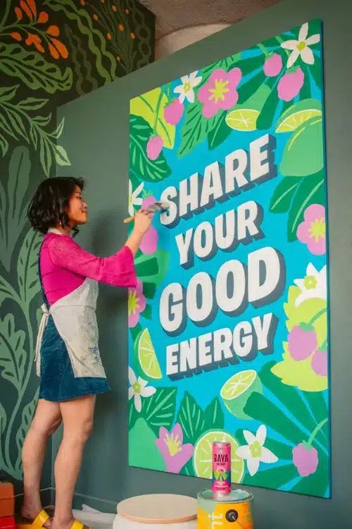
What does Lauren Hom do?
She is a designer and she is good at lettering. The artwork is organic and tailored to the client’s needs.
Specializing in food art and murals, the reason why you more or less copy her work is that she uses organic colors and fonts so that the brand pops out. | Murals are giant paintings on the walls.
Plus Points of Lauren Hom:
- The navigation is logical.
- It is clear what she’s offering.
- Enough white spaces around the articles.
- The layout and color distribution help the content.
- The portfolio is clearly visible and fits the subject.
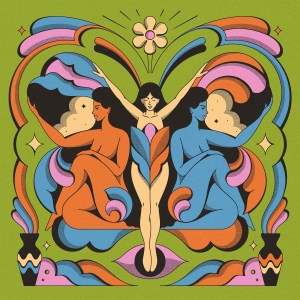
6. Donna Adi

What does Donna Adi do?
Donna Adi is a skilled designer renowned for her ability to blend bold colors with creative designs. She creates striking visuals that highlight her clients’ products and messages, offering a fresh perspective on graphic design across various projects, including illustrations and marketing materials.
Donna improves the visual identity of established brands and startups by creating attractive image-driven stories that clearly convey their message.
Some of her designs I like.
What can you do with such skills? You create a branded image that highlights the person or the product. Companies, big or small, can hire you and add you to their design team to help their designs stand out.
Plus Points of Donna Adi:
- The navigation is logical.
- It is clear what she’s offering.
- Enough white spaces around the articles and images.
- Great examples of recent works.
- The layout and color distribution help the content.
- The portfolio is clearly visible and fits the subject.
7. Mike Perry
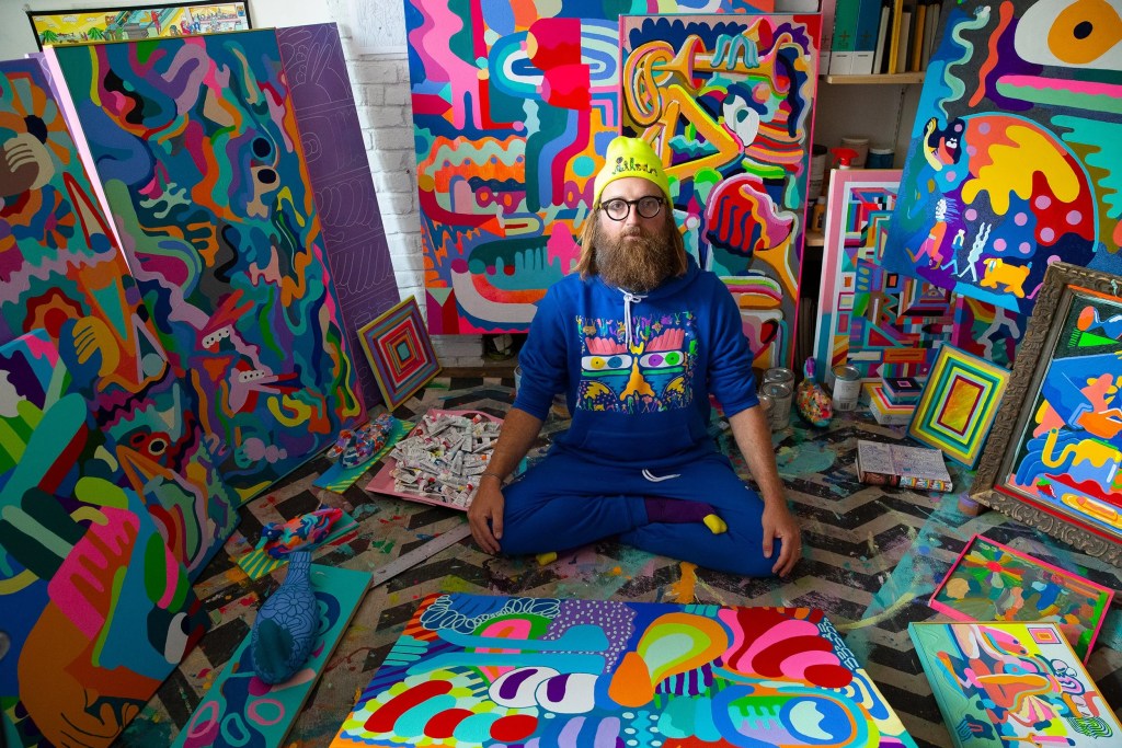
What does Mike Perry do?
Mike Perry is a Brooklyn-based artist known for his Emmy-winning work on Broad City. He creates a variety of art, including paintings, animations, sculptures, books, public installations, and more, all inspired by his imaginative vision.
Plus Points of Mike Perry:
- The navigation is straightforward.
- It is clear what you get.
- All links are working correctly.
- There are enough white spaces around the articles and images.
- Great examples of recent works.
- The layout and color distribution help the content.
- The portfolio is clearly visible and fits the subject.
8. Pavlov Visuals
What does Pavlov Visuals do?
Pavlov (Ryan Dean Sprague) is an American graphic designer & illustrator based in Dallas, Texas. Keeping creativity and client commitment at the heart of the business, Pavlov Visuals has helped countless brands find their voice.
His clientele is pretty impressive; it is a good mix from motion graphics to imagery, and Pavlov has a wide range of experience in the field.
Plus Points of Pavlov Visuals:
- The navigation is to short.
- It is clear what they do, but it can be confusing.
- All links are working correctly.
- Great examples of recent works.
- The layout and colors support the content, but it may be too dark.
- The portfolio is clearly visible and fits the subject.
9. Airbnb

What does Airbnb do?
Airbnb is an online platform launched in 2008 that connects homeowners with travelers seeking short-term rentals worldwide. It allows users to list and book unique accommodations, offering features like photos, descriptions, and pricing.
Travelers can easily filter search results based on location, price, and amenities. Additionally, Airbnb features Airbnb Experiences, enabling local hosts to provide activities and tours, fostering cultural connections.
Plus Points of Airbnb Website:
- Airbnb offers options from budget rooms to luxury villas.
- Previous renter reviews help users decide.
- Clear layout that helps you find what you’re looking for.
- Airbnb Experiences allow users to join activities hosted by locals.
- The platform suits solo travelers, families, and business trips.
- All links are working, and the colors make the offers stand out.
10. Dropbox

What does Dropbox do?
Dropbox is a popular cloud storage service founded in 2008. It allows users to store files online, access them from different devices, and share them easily.
Suitable for both individuals and businesses, Dropbox provides features like file versioning, collaboration tools, and integration with many other apps.
Its strong storage options make file management easy and ensure that important documents are accessible anytime and anywhere.
Plus Points of Dropbox:
- The homepage has a simple design that highlights key messages and visuals, keeping users focused.
- Engaging images and animations effectively highlight Dropbox’s features, making the homepage visually appealing and easy to understand.
- Well-placed buttons encourage users to sign up, download the app, or learn more about specific features, driving engagement and conversions.
- Featuring reviews and success stories adds credibility and provides social proof, making potential customers more inclined to trust the service.
- Key functionalities are highlighted, making it easy for users to grasp the capabilities of Dropbox at a glance.
- The navigation menu is organized, helping users find what they need easily.
- An integrated search bar allows users to find specific features, articles, or support quickly, enhancing usability.
FAQ Tips for Designing a Layout
How can I optimize my layout for SEO?
To optimize your SEO layout, use clear headings (H1, H2, H3), bullet points or numbered lists for readability, and naturally include important keywords. Also, enhance page load speed and ensure mobile responsiveness, as these affect search engine rankings. Use WebP for your images.
How do I choose the right layout for my website?
Think about your content and audience. Different content types (like blogs, portfolios, e-commerce) need different layouts. Ensure the layout emphasizes your key elements.
What are the best practices for using whitespace in my design?
Use whitespace to create visual breathing room between elements. This improves readability and helps to draw attention to key components like calls to action or important messaging.
How can I ensure my layout is mobile-friendly?
Implement a responsive design that adjusts seamlessly across devices. Test your layout on multiple screen sizes to ensure usability and accessibility for all users.
What role does visual hierarchy play in layout design?
Visual hierarchy directs users’ attention to important information. Use contrasting colors, varying font sizes, and positioning to lead users through your content logically.
How can I maintain consistent branding across my site?
Use a cohesive color palette, typography, and imagery that reflect your brand identity. Consistency in these elements helps establish trust and recognition with your audience.
Conclusion
In conclusion, it is better to think about how the user must navigate through your website than what you think is best.
The user views your website as a whole, including imagery, videos, portfolios, and the helpful aspects that, when executed properly, attract the right audience.
Looking at the structure and navigation in these examples, you can see that they strive to achieve this.
So, look at some design examples, examine them, and apply those strategies to your website.

“This is such an honest breakdown of WordPress! I like how you balanced the challenges with the long-term benefits — especially the part about becoming more self-sufficient. Totally agree that the learning curve pays off once you realize how powerful and flexible WordPress really is.”
LikeLike
Thank you for the comment. I do my best to breakdown hard topics and explain it with insight.
LikeLike
LikeLike
You are welcome, and thanks for the comment.
LikeLike