Written by MarJorie Jones. ✅ Edited and published by Bonny Isselt.
For local business owners and solo founders, small business branding can feel “done” until customers start drifting, inquiries slow, or familiar faces stop coming back. The challenge is rarely the product; it’s that the brand signals people rely on have gotten fuzzy or dated, and brand relevance in 2026 is shaped by faster expectations, noisier competition, and an increasingly digital-first customer journey. Consistent branding can increase revenue by around 20%, yet the majority of customers still feel treated like numbers rather than individuals, which means a thoughtful refresh is one of the most practical ways to close that gap.
A good business brand update doesn’t mean starting over; it clarifies what the business stands for and makes it easier for the right people to choose it. Treated well, a refresh proves brand refresh importance by turning customer re-engagement into a practical, repeatable outcome.
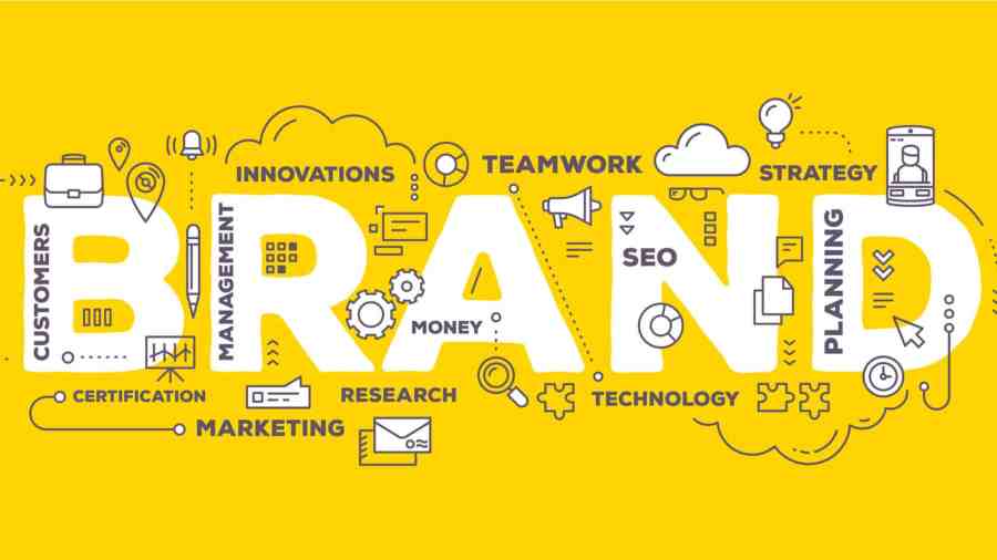
Understanding What a Brand Refresh Really Does
A brand refresh is not a makeover for its own sake. The point is to sharpen what you promise customers, highlight what makes you different, and earn back attention that has faded with time. A helpful definition is that a brand refresh is updating, modernising, and energising, not fundamentally changing it.
This matters because clearer messaging makes it easier for the right people to say yes, faster. Stronger differentiation helps you compete on meaning, not just price. And renewed attention can bring past customers back into the conversation when they are ready to buy again.
Imagine a café that people like, but cannot describe. By tightening its “why us” and refining its look and words, the business turns vague interest into a clear choice. In practice, a brand refresh is an update of visual and verbal elements, core identity, mission, and values.
With the purpose clear, the practical updates become much easier to choose and prioritize.
Refresh the Pieces: 9 Beginner-Friendly Brand Upgrades
A brand refresh works best when it sharpens what you already stand for, clarifies your value, strengthens differentiation, and creates a look that grabs attention, without confusing loyal customers. Use these upgrades as mix-and-match building blocks, starting small and scaling up.
- Start with customer feedback (before you touch design): Collect 10–15 quick responses from real customers: “What three words describe us?” “What do you buy from us?”, and “What almost stopped you from purchasing?” A simple approach is asking your customers at checkout, by email, or in a short link on receipts. You’re looking for patterns you can protect (what people already love) and friction you can fix (what’s unclear).
- Do a 30-minute brand audit of your “recognition pieces”: Put your logo, colors, website header, packaging, and social profiles side-by-side on one page. Circle what must stay recognizable (name, icon shape, signature color) and mark what feels inconsistent (different fonts, mismatched tones, outdated photos). This connects directly to your value proposition: if your visuals don’t match what you promise, customers hesitate.
- Logo redesign: update, don’t erase: If people know you by your mark, a total reset can backfire; aim for a “same, but cleaner” redesign. Keep one anchor (the icon, the outline, or the first letter) and modernize the rest: simplify details, improve spacing, and create a version that works at small sizes. The fact that 75% of people recognize a brand primarily by its logo is a good reminder to protect recognizability while you improve clarity.
- Brand color selection: lock in a simple palette you can actually use: Choose 1 primary color, 1 secondary color, and 2 neutrals (light and dark). Test them in three places: on a phone screen, printed on regular paper, and against product photos. If contrast is weak anywhere, adjust. Write down the exact color codes so your website, menus, and social graphics stop drifting.
- Company slogan creation: turn your promise into one clear line: Draft 10 rough options, then narrow to 3 using a simple formula: Who it’s for + what you deliver + the outcome. Example: “Fresh lunches for busy downtown teams.” Avoid puns and buzzwords; your slogan should make your differentiation obvious in five seconds.
- Website revamp: fix the top of the page first: Refresh your homepage in this order: headline (what you sell), supporting line (why it matters), one primary button (what to do next), and trust cues (reviews, guarantees, photos). Then check mobile speed, readability, and whether contact info is visible without scrolling. This is where your refreshed value proposition becomes real: if visitors can’t quickly “get it,” they won’t convert.
- Packaging design: make it easier to spot and easier to trust: Keep one familiar element (logo placement, a signature color band, or a pattern) and improve the rest for clarity. Put the product name first, then the key benefit, then the essentials customers look for (size, flavor, instructions, care). Print one small batch and ask a friend to identify it from 6 feet away on a shelf. If they hesitate, simplify.
- Update your brand voice with a mini “say this / not that” list: Write 5 phrases you want to sound like and 5 you want to avoid, based on your audience and positioning. For example: “friendly and plainspoken” might mean “Talk to a real person” instead of “Submit a support ticket.” This keeps your refreshed look and your customer experience aligned.
- Roll out changes in phases and watch what happens: Start with the highest-impact, lowest-effort touchpoints, social profile images, email signature, website header, then move to packaging and signage once you’re confident. Track one or two simple signals for 30 days (site inquiries, add-to-cart rate, repeat orders) to see if the refresh is improving attention and reducing confusion. A phased approach also makes budget and timing decisions much easier to handle calmly.
When you treat each upgrade as a small experiment, guided by customer input and anchored in what you want to be known for, you can modernize your brand without losing the recognition you’ve earned.
Brand Refresh Questions, Answered
If you’re stuck or uncertain, these quick answers can steady your plan.
A: If customers hesitate, ask basic clarification questions, or confuse you with competitors, your positioning or visuals may be outdated. Another sign is inconsistency: different messages, different looks, and no clear “reason to choose us.” Start small by checking your homepage, social bio, and top product page for clarity in 10 seconds.
A: Visual updates can quickly signal “modern and trustworthy,” but sudden shifts can also trigger doubt. Because people form impressions fast, 0.05 seconds is a useful reminder to keep one familiar anchor while you refine. Test the new look on mobile first, then roll it out gradually.
A: Ask short, specific questions and make it easy to respond in under two minutes. Use a mix of quick polls, a few one-on-one calls, and a simple “pick A or B” test for taglines or visuals. Look for repeated phrases, not one-off opinions.
A: Freeze the order of decisions: strategy first, then name, then visuals, then rollout. Put changes into two buckets: “must-have to reduce confusion” and “nice-to-have for later,” so you protect your budget and energy. Set a two-week sprint for one touchpoint, measure results, then decide what to adjust.
A: Start with plain-language guides on positioning, messaging, and basic marketing funnels, then practice by rewriting your headline and offer on one page. If you want to lead the project with less stress, structured management learning can help with planning, decision-making, and stakeholder communication. Some people also explore a business management bachelor’s degree. Keep it practical by choosing resources that include templates and real-world exercises.
Small, measured updates add up fast when you stay consistent and listen closely.
Brand Refresh Milestones You Can Check Off
Keep the momentum going:
This checklist turns a brand refresh into clear, doable rebranding milestones. Use it to track progress, reduce guesswork, and keep your rollout aligned across every customer touchpoint.
✅ Confirm your ideal customer and one clear promise in plain language
✅ Audit your top three pages and bios for instant “what you do” clarity
✅ Rewrite your headline, offer statement, and CTA to match today’s needs
✅ Refresh colors, type, and imagery while keeping one familiar brand anchor
✅ Test two message or visual options with a quick customer poll
✅ Update templates for email, social posts, invoices, and proposals
✅ Track weekly results using one simple dashboard and two key metrics
Check off one item today, then keep building from what works.
Start Your 2026 Brand Refresh With One Clear Next Step
When a business grows, the brand can lag behind, leaving customers unsure what to expect and owners stuck second-guessing what to change.
A steady, milestone-based approach keeps the work manageable and builds business branding confidence, so decisions come from clarity instead of pressure. The brand renewal benefits show up in sharper messaging, more consistent touchpoints, and a stronger sense of connection with the right customers.
A brand refresh works best when it’s paced, purposeful, and aligned with what customers value. Choose one item from the checklist to complete today and mark it done. That small win creates brand refresh motivation and supports long-term growth through trust, recognition, and resilience.
 Dropner Graphic Explainer