Written by David Macullum. ✅ Edited and published by Bonny Isselt.
Have you ever been fully prepared to buy something online, credit card practically in hand, only to abandon the purchase halfway through checkout? Not because the price changed. Not because you found a better option. You just stopped.
Most online store owners assume cart abandonment happens earlier in the journey. They think customers leave because products aren’t compelling enough or prices aren’t competitive enough.
Sometimes that’s true. But after watching hundreds of online stores over the years, I’ve become convinced that a surprising number of sales die much later. Right at the finish line.
The customer wanted the product. The store simply made buying it harder than it needed to be. The frustrating part is that these lost sales rarely announce themselves. There’s no angry email. No complaint. No warning signs. People just disappear.
Strange Thing About Online Shopping
A customer who reaches checkout is different from a customer browsing category pages. They’re not exploring anymore. They’re not comparing twenty alternatives. In most cases, they’ve already made the decision. That’s what makes unnecessary checkout steps so costly.
Imagine inviting friends over for dinner. Everyone’s seated. The food is on the table. Then you decide that’s the perfect moment to explain the entire history of the recipe before anyone can eat.
Technically, nothing is wrong. But you’re creating friction where people expected completion. I’ve seen online stores do the digital equivalent countless times. The shopper clicks “Buy Now.” The website responds with paperwork.
The Account Creation Trap
Years ago, forcing account creation became standard practice. Stores wanted customer data. Marketing teams wanted email lists. Everyone wanted a deeper relationship with the buyer. Reasonable goals. Terrible timing.
A customer trying to purchase a $20 item usually isn’t thinking about building a long-term relationship with your brand. They’re thinking about solving a problem.
Maybe they need replacement headphones. Maybe they need a birthday gift. Maybe they need dog food before tomorrow. That’s it.
Yet many checkout processes suddenly introduce a completely different task: Create a password. Verify an email. Confirm your account. Remember, the login credentials you’ll probably forget within two weeks.
At that moment, the store has quietly shifted the customer’s attention away from buying and toward administration. That’s rarely a winning move.
Small Frustrations Add Up Faster Than People Think
One checkout field isn’t a problem. Neither is one extra click. The issue is accumulation. A shipping field here. A phone number field is there. A promotional checkbox. A mandatory survey question. A coupon code box that accidentally reminds shoppers they might be missing a discount.
Individually, these things feel insignificant. Collectively, they create a subtle sense of effort, and effort changes behavior. I once watched a usability session where a shopper spent nearly ten minutes choosing products. They seemed genuinely interested.
Then they reached checkout and encountered a form that looked longer than expected. Their reaction wasn’t dramatic. They leaned back in their chair and said, “Eh, I’ll do it later.” They never came back.
That moment stuck with me because it perfectly captured how many sales disappear. Not through rejection. Through postponement. This often becomes abandonment.
Customers Aren’t Evaluating Your Checkout
This is something many merchants misunderstand. Shoppers don’t consciously analyze checkout design. Nobody says, “This checkout contains too many sequential interactions.”
Nobody talks like that. What they feel is something much simpler. “This is annoying,” or “This is taking longer than I expected.” “I’ll come back later.” The language is casual. The revenue impact isn’t.
Mobile Changed the Rules
Desktop checkout problems were annoying. Mobile checkout problems are brutal. Think about where people shop now. On a couch. In a waiting room. During a lunch break. Standing in line somewhere.
Attention spans aren’t necessarily shorter than they used to be. Attention is simply competing against more things. Text messages arrive. Notifications appear. Someone starts talking. The dog barks. Life happens.
Every additional checkout step increases the chance that reality interrupts the purchase. A smooth checkout doesn’t just improve convenience. It protects momentum before the outside world steals it.
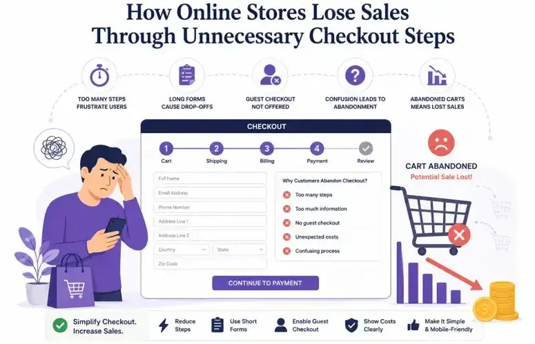
Checkout Pages That Feel Endless
We’ve all encountered them. You move from cart to checkout. Then to shipping. Then to delivery options. Then to payment. Then, to review.
Then to confirmation. Each page looks harmless. By page five, however, something starts feeling off. The process begins to feel larger than the purchase itself.
That’s where many stores accidentally lose perspective. Buying a simple product shouldn’t feel like applying for a mortgage. Yet some checkout experiences aren’t far off.
Psychology Nobody Talks About
There’s another issue that doesn’t get enough attention. Every additional step creates an opportunity for second thoughts. The longer someone remains in checkout, the more opportunities they have to reconsider.
Maybe they don’t need the item right now. Maybe they should compare prices elsewhere. Maybe they should wait until next week. Maybe they should save money.
A streamlined checkout minimizes those conversations happening inside the customer’s head. A complicated checkout gives them room to grow. Doubt grows surprisingly fast.
What High-Converting Stores Tend to Understand
The best-performing stores I’ve worked with weren’t obsessed with optimization tricks. They weren’t endlessly tweaking button colors. They weren’t running meetings about whether a headline should contain seven words or nine.
They focused on friction. They treated friction almost like a leak in a pipe. Small leaks matter. Enough small leaks become expensive.
That’s why many WooCommerce merchants eventually decide to add a Quick Buy Button to WooCommerce Products. The goal isn’t simply speed for the sake of speed. It’s reducing the number of moments where a customer can drift away from an intended purchase.
That distinction matters. People often think checkout optimization is about efficiency. It’s really about preserving intent.
Sometimes Simpler Feels Almost Too Simple
Interestingly, store owners occasionally become nervous when checkout becomes very short. They worry customers aren’t seeing enough information. They worry something important is being skipped. They worry the process feels too easy.
Customers rarely share that concern. Most shoppers don’t wake up hoping for a longer checkout experience. They appreciate clarity. They appreciate speed. And they appreciate stores that respect their time.
Funny enough, the checkout experiences that feel almost invisible are usually the ones generating the strongest conversion numbers.
Stores That Keep More Sales
After a while, a pattern becomes impossible to ignore. Stores with cleaner checkout experiences don’t necessarily have better products. They don’t always have lower prices. They aren’t automatically better brands.
They simply create fewer opportunities for customers to leave. That’s a surprisingly powerful advantage. A streamlined purchasing flow, including approaches built around a WooCommerce Quick Buy experience, works because it aligns with human behavior. Most shoppers aren’t looking for a journey once they’ve decided to purchase. They’re looking for an ending.
Conclusion
A lot of e-commerce advice focuses on attracting visitors. More traffic. More clicks. More awareness. Those things matter. But many stores already have customers willing to buy.
The real problem appears a few moments later, inside checkout, where unnecessary steps quietly chip away at conversion rates. Not dramatically. Not visibly.
Just one abandoned cart at a time. The tragedy is that these customers were often ready. They liked the product. They accepted the price. They clicked the button. Then the process got in the way. Sometimes that’s all it takes for a sale to disappear.
